
Shrink the Symbolic Size of Payments
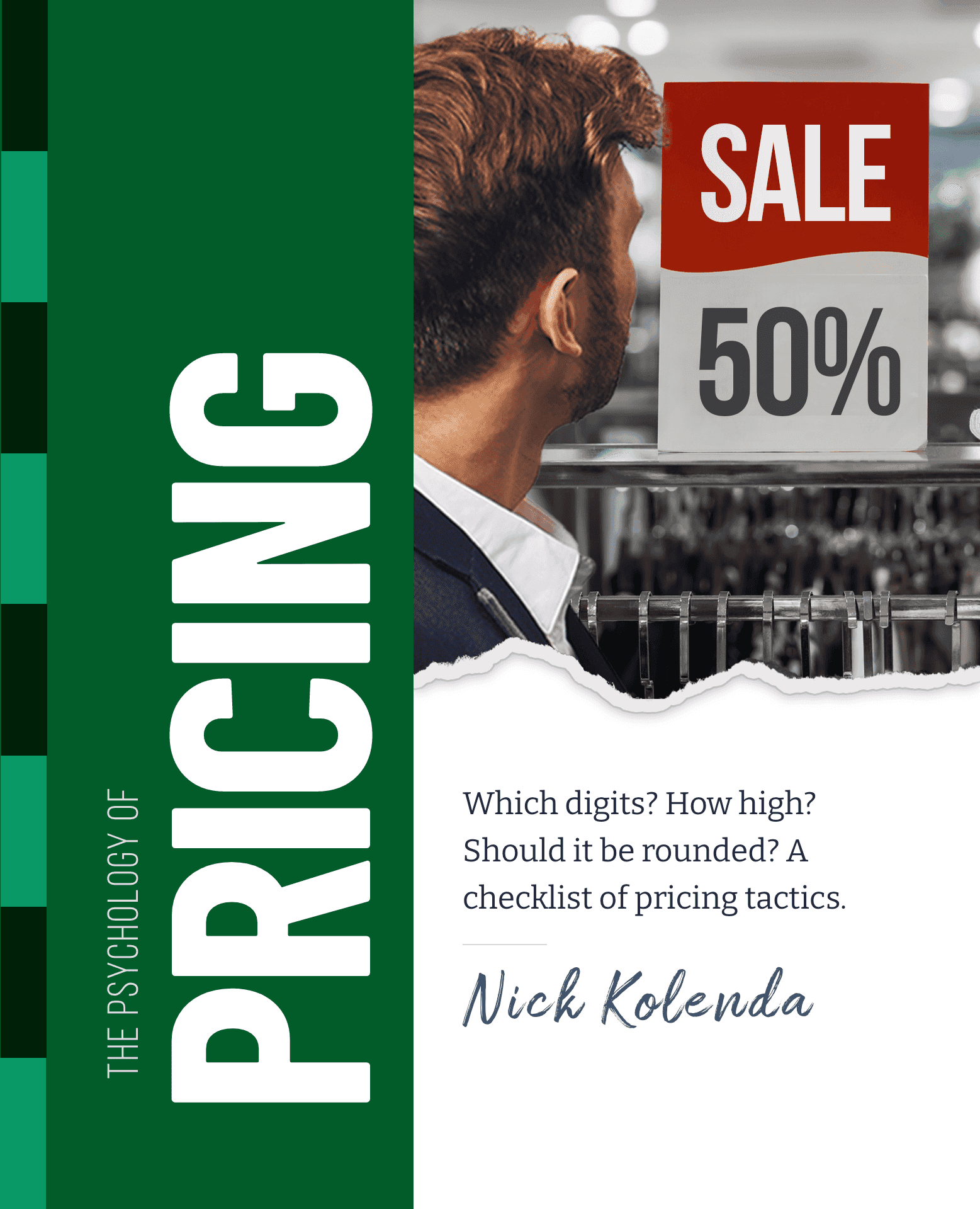
Price Design
Shrink the Symbolic Size of Payments
Help customers imagine "getting more" while "paying less."
Space can distort meaning.
For example, a list of benefits in a pricing plan can seem smaller (and less appealing) with a lot of empty space (Kwan et al., 2017).

But what if smallness is desired? Like pricing?
For example, you typically see two sections on a product page:
- What you get
- What you pay
Try shrinking the spatial width of payment sections so that customers feel like they're getting more while paying less.
Like Amazon pages:

After sharing this idea in my newsletter, I noticed that Walmart changed the layout of their product pages a few months later to apply this advice:

Why It Works
- Price Feels Smaller. Something about the payment feels smaller, and customers blame the price.
- Checkout Seems Easier. A similar effect happens with the "amount" of effort — less ink, less effort.
- Buttons Feel More Clickable Toward the Right. By shrinking the size of a payment section, you can push this interaction further toward the right side of the screen so that it feels more touchable and clickable for right-handers (who comprise most of the population). In a pilot study, I confirmed that right-handers prefer buttons on the right, while left-handers prefer buttons on the left.
How to Apply
- Categorize Layouts By Costs and Benefits. In their old page, Walmart included details about the product inside the payment section. But now there's a clearer distinction between what you get vs. what you pay.
- Shrink at Every Gestalt Level. Payment sections should consume less space in the layout, while prices should consume less space within its section of the layout.
- Don't Forget SaaS and Other Contexts. Perhaps you'll get more signups if your price consumes a smaller portion of height, leaving benefits to consume most of the space.

Want more tactics?
Get all my free pricing tactics