
Design Healthy Packaging With Light Colors
Packaging
Design Healthy Packaging With Light Colors
Dark colors seem heavy, while light colors seem...light, as if they're easier to lift.
Light colors seem easier to lift.
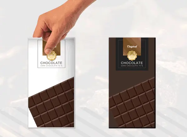
Customers attribute this heaviness to the product. Chocolate in dark packaging seems rich and filling, but chocolate in light packaging seems light and healthy.
Light colors seem natural, too:
...au naturel colors are defined as undyed, non- artificial, untreated, and unprocessed colors, that bring to mind something earthy, genuine, unadulterated, and expressing authenticity. Hues of beige (e.g., cream, sandy beiges, and mellow browns) belong to this color family (Marozzo et al., 2020)

Beige packaging outperformed orange packaging for both rice and carrots (even though carrots are orange; Marozzo et al., 2020).

Indeed, food seems less healthy in brightly saturated packaging (Mead & Richerson, 2018).
Choose light, muted, and natural colors for healthy packaging.
- Arnheim, R. (1997). Visual thinking. Univeristy of California Press.
- Marozzo, V., Raimondo, M. A., Miceli, G. N., & Scopelliti, I. (2020). Effects of au naturel packaging colors on willingness to pay for healthy food. Psychology & Marketing, 37(7), 913-927.
- Mead, J. A., & Richerson, R. (2018). Package color saturation and food healthfulness perceptions. Journal of Business Research, 82, 10-18.

Want more tactics?
Get all my free packaging tactics