Products Seem Expensive With More Padding
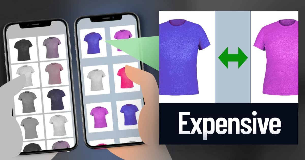
In a digital catalog, the amount of padding can influence the perception of prices, based on our experience with physical stores.

Overview
In physical stores, the amount of space influences prices.
A lot of empty space? Managers need to raise prices to pay for this real estate.
This belief is so familiar that, ironically, customers apply this logic with online stores. In a digital catalog, products seem more expensive when surrounded by more padding, even though this space doesn't cost anything (Huang, Lim, Lin, & Han, 2019).
Researchers confirmed that this belief is originating from physical stores.
Therefore, adjust the padding of your digital catalog:
- Do Customers Want a Good Price? Display a tight catalog.
- Do Customers Want High Quality? Display a spacious catalog.
Adjust two types of padding:
- Alignment Padding. Space between rows and columns.
- Image Padding. Space within a product image.
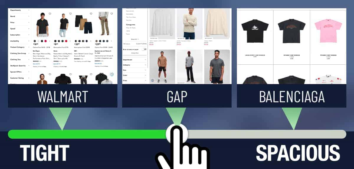
I searched a few websites. Their padding seems to align with their brand images:

- Walmart crams four products in each row.
- Gap shows three products.
- Balenciaga shows three products, but adds more space in the images.
Other takeaways:
- Prices Seem Cheaper in Clutter. Cluttered websites sometimes convert better than clean websites. Now it makes sense. We associate low prices with messy and cluttered stores, and this belief infiltrates our online shopping.
Other New Stuff
- Prices and Font Sizes - I added new research to my tactic on prices and font sizes. It offers more guidance on how to use this technique.
- Frequent Paychecks Increase Spending - In a study with 30,000 banking customers, people spend more if they get paid more frequently. Regardless of the amount. If you get paid more frequently, you believe that you possess more funds to pay for goods and services (De La Rosa & Tully, 2022).
- Lonely Customers Prefer Angular Shapes - They prefer sharp fonts, logos, products, app icons, and other design elements (Chen, Jiao, Fan, & Li, 2021).